
A post by Engram. Essential reading on the economy!
Tuesday, August 29, 2006
Americans Hate their Fabulous Economy
Polls consistently show that Americans are rather negative about the economy, and many have wondered why that might be considering that our economy is the envy of the world (as well it should be). The source of our pessimism is a bit of a mystery, and it is one that I am going to pursue.
For the moment, I'll simply note that I have identified what may be a contributing factor to our unwarranted despair: reporters rarely use charts, and that allows them to wax poetic about the "jobless recovery," "worrisome signs of inflation," "record setting deficits," and other such nonsense. Charts anchor the mind to the raw data, which makes it hard to use bumper-sticker slogans that mislead (and demoralize) more than they clarify.
In any story about the economy, there is never an excuse not to use a chart, but reporters almost never do. First, I'll show you a chart that illustrates how pessimistic you are these days compared to earlier years. To make this chart, I went to a well known polling site, copied the numbers into an Excel spreadsheet, and presto:
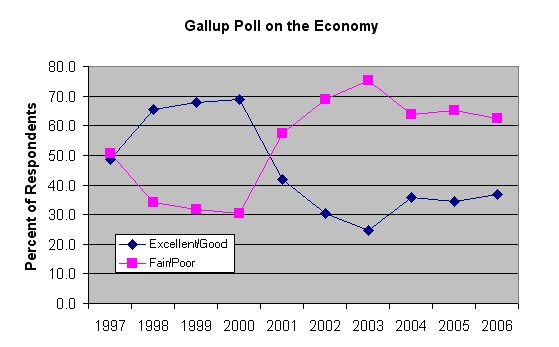 So, in 1998 (during the Clinton era), Americans were 65/35 on the optimistic side, but now (during the Bush era) we are 65/35 on the pessimistic side. A complete reversal. Are things really that bad? No. In fact, the evident pessimism is borderline ridiculous, but it's hard to appreciate that unless you look at some simple charts. I'll be looking at quite a few as time goes on, but let's consider some right now.
Growth of the Gross Domestic Product (GDP) is, perhaps, the most basic measure of the health of any economy. A growth of 1% is often described as anemic, 2% is so so, 3% is good and 4% is excellent. Let's take a look at that measure during the Clinton and Bush eras (I got these numbers here):
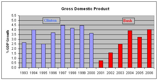
Give the man credit: GDP growth was very good under Bill Clinton (averaging 3.7%). It took a hit during the early years of the Bush administration, but it has snapped back smartly since, right back to where it was during the Clinton years (the 2006 value is an average of the first 2 quarters of the year).
Why did things go south for a while? First, the stock market bubble popped. The Nasdaq's long slide (i.e., the dot-com crash) began in March of 2000 and continued until October of 2002. That sucked a lot of life out of the economy. Second, September 11, 2001 happened. In light of those two unforseen calamities, it's amazing how well the economy has been doing in 2004, 2005 and so far in 2006. Whether or not Bush's policies are responsible for the impressive recovery is a matter of debate, but it is clear that, at a minimum, his policies have not choked off economic growth.
Give that man credit, too. Except no one does. Despite the fact that GDP growth is right back to where it was during the Clinton era, Americans don't feel the same way about the economy, to say the least. Why not? The jobless recovery, perhaps? No story about the so-called jobless recovery should have gone to print without some basic charts that would provide some perspective. Here's a useful, perspective-supplying chart (data acquired here):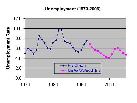
What you can see is that unemployment has been relatively low all throughout the Clinton and Bush administrations. Thus, all of the obsessing about the "high" unemployment rate during the last presidential campaign was so much nonsense. It was made possible because reporters avoided using charts like this one. Let's zoom in on the unemployment situation just during the Clinton and Bush years:
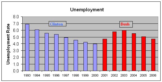
The economy bounced back in terms of GDP by 2004, then the unemployment rate -- which was never very high -- began to drop as well. In fact, it's now right back to where it was during the Clinton years. But back then, we liked the economy. Now we don't.Inflation? Is that the problem? Let's look at the chart (based on data obtained here):

Those two stories about budget deficits and stagnant wages -- like almost all stories about the state of economy -- don't do that. You can learn more from a few informative charts than you can from reading the words of a reporter who has an agenda that is advanced, not by showing you the actual numbers, but by using bumper-sticker slogans to create the impression that things are "spiraling out of control." Oh wait, that's the phrase reporters use to characterize Iraq. Well, they don't use charts for that purpose, either (and for the same reason).
posted by Engram 9:53 AM
|